Chart types
9a: Tabular data
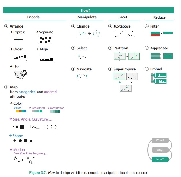
Recap: How to design viz idioms
Recap: Data Types
- Tabular data
- Networks
- Geographic / spatial
- Fields
- Hierarchical
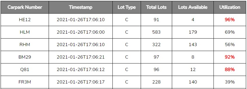
Tabular data
Recap: Data scales
D3 Graph Gallery
But there are other ways to categorize charts.
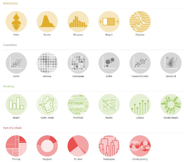
D3 Graph Gallery, by Yan Holtz
Idiom: Bar Chart
What: Data |
1 quantitative value attribute, 1 categorical key attribute |
How: Encoding |
Encode bar marks, express value attribute with aligned vertical position, separate key attribute with horizontal position |
Why: Task |
Task lookup and compare values |
| Scale | Key attribute: Up to hundreds |
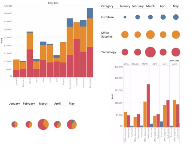
Idiom: Stacked Bar Chart
What: Data |
Multidimensional table: 1 quantitative value attribute, 2 categorical key attributes |
How: Encoding |
Bar glyph with length-coded subcomponents of value attribute for each category of secondary key attribute (typically using color as an identity channel). Separate bars by category of primary key attribute. |
Why: Task |
Part-to-whole relationship, lookup values, find trends. |
| Scale | Key attribute (main axis): dozens to hundreds of levels. Key attribute (stacked glyph axis): several to one dozen |
Recap: which viz?
Part-of-whole relationship: D3 Graph Gallery - 100% Stacked Barplots
Reading: Understanding Stacked Bar Charts: The Worst Or The Best?
Idiom: Pie Chart / Donut Chart
What: Data |
Table: 1 quantitative attribute, 1 categorical attribute |
How: Encoding |
Encode Area marks (wedges) with angle channel; radial layout |
Why: Task |
Part-to-whole relationship |
| Scale | One dozen categories |
Example: The hate of pie charts harms good data visualization
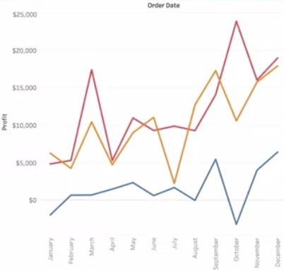
Idiom: Line Chart
What: Data |
Multidimensional table: 1 quantitative value attribute (often counts / amount), 1 quantitative key attribute (often time / percentage), 1 categorical key attribute (color) |
How: Encoding |
Show counts (aligned vertical position) changing across time / percentage (aligned horizontal position). |
Why: Task |
Show trends, comparisons |
| Scale | Key attributes (time): up to hundreds of time points. Key attributes (each color): several to one dozen |
Idiom: Stacked Area / Streamgraph
What: Data |
Multidimensional table: 1 quantitative value attribute (often counts / amount), 1 quantitative key attribute (often time), 1 categorical key attribute (color) |
How: Encoding |
Use derived geometry to show layers across time, layer height encodes counts. |
Why: Task |
Show holistic view, part-to-whole relationship, trends. |
| Scale | Key attributes (time): up to hundreds of time points. Key attributes (each area): several to one dozen |
D3 Graph Gallery - Stacked Area
Example: Namegrapher
Example: Flourish: Streamgraph
Idiom: Scatterplot
What: Data |
Table: 2 quantitative value attributes |
How: Encoding |
Express values with horizontal and vertical spatial position and point marks. |
Why: Task |
Find trends, outliers, distribution, correlation; locate clusters. |
| Scale | Items: Hundreds |
D3 Graph Gallery - Scatterplot
You can add in a 3rd quantitative attribute (size of mark). You can also add in categorical attributes (color, shape of mark).
Example: Connected scatterplot, Observable HQ
Reading: Using a d3 voronoi grid for better interactive experience, Visual Cinnamon (Nadieh Bremmer)
Idiom: Heatmap
What: Data |
Table: two categorical key attributes. One quantitative value attribute (color) |
How: Encoding |
Dense encoding of data, typically as small boxes aligned in a huge grid, with color used as a quantitative magnitude channel. |
Why: Task |
Find clusters, outliers, summarize |
| Scale | Items: Up to a million. Categorical attribute levels: hundreds. Color quantitative attribute levels: 3 to 11 |
Example: Wiki: Heatmap - History (Matrix)
Example: Where chess pieces are most often captured (image)
Idiom: Scatterplot Matrix
What: Data |
Table with a whole bunch of attributes |
How: Encoding |
Scatterplots in 2D matrix alignment |
Why: Task |
Find corrletation, clusters, outliers |
| Scale | Attributes: Up to a dozen. Items: up to hundreds |
D3 Graph Gallery - Scatterplot Matrix / Correlogram
Data: Iris.csv actual data
Idiom: Radar
What: Data |
Table with 3 to 12 quantitative attributes. 1 categorical key attribute (color) |
How: Encoding |
Layout attributes radially in a spider-like plot |
Why: Task |
Comparison, find outliers |
| Scale | Quantitative attributes: 3 to 12. |
Example: Which Sport is the toughest?
Example: Fast food burger ranks
Example: MCI radar
Idiom: Parallel Lines
What: Data |
Table with 3 to 12 quantitative attributes. 1 categorical key attribute (color) |
How: Encoding |
Layout quantitative attributes along spaced out guide lines |
Why: Task |
Comparison, find outliers |
| Scale | Quantitative attributes: 3 to 12 |
D3 Graph Gallery - Parallel Lines
Example: How Nafissatou Thiam beat the odds to claim the heptathlon gold in Rio, Guardian
Idiom: Histogram / Density plot (frequency distribution)
What: Data |
1 quantitative attribute, typically count/amount. |
How: Encoding |
Quantize distribution into bins for bar chart (histogram) or show it as a line curve (frequency distribution) |
Why: Task |
Show distribution, find outliers |
Scale |
This is chart that aggregates and presents summary data. Will cover more under manipulate / facet /reduce lecture. Scale like bar chart / line chart. |
Idiom: Boxplot / Violin plot / Beeswarm
What: Data |
1 quantitative attribute, typically count/amount. |
How: Encoding |
Compact summary / aggregated view that shows distribution - median, quartiles, outliers. |
Why: Task |
Show distribution, find outliers |
Scale |
This is chart that aggregates and presents summary data. Will cover more under manipulate / facet /reduce lecture. |
Example: Age and Occupation, Nathan Yau
Example: Largest vocabulary in Hiphop, The Pudding
Storytime: Boxplot vs bar charts
Questions?
Chi-Loong | V/R