6a: Color
Color
- Perception: How the eye perceives color
- Specification: How we specify color
- Use: Use of color in visualizations
Visible electromagenetic spectrum

Visible light is roughly in the wavelengths of 400nm (4 x 10⁻⁷m) to 700nm (7 x 10⁻⁷m).
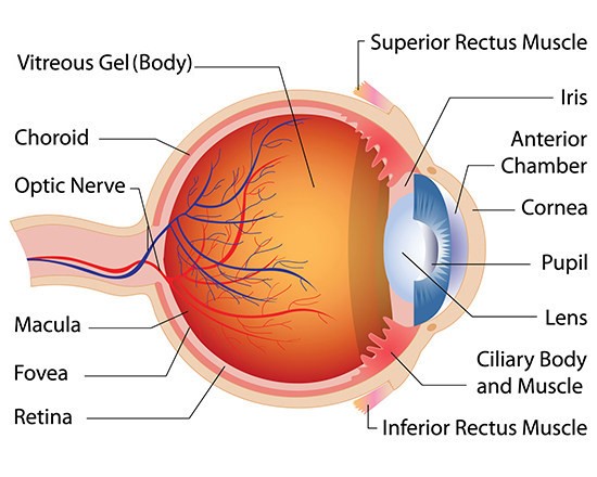
Eye Structure
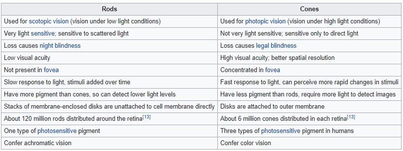
Eye: Rods and Cones
More detail on the fovea
Cones: photoreceptor wavelength
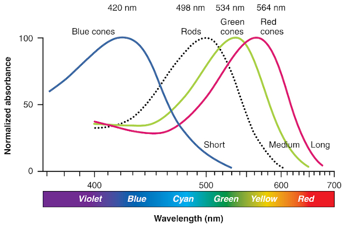
Red cones, or L-cones. 64% of total cones, maximally sensitive to long-wave light
Green cones, or M-cones. 32% of total cones, maximally sensitive to medium-wave light
Blue cones, or S-cones. 2 – 7% of total cones, maximally sensitive to short-wave light
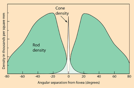
Cones: distribution
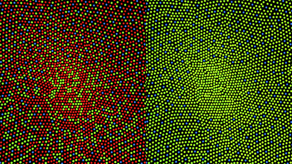
Left: Illustration of distribution of cones in fovea of human with normal color vision.
Right: Illustration of distribution of cones in fovea of human with protanopia (green-red color blind), with no red cones
What color does the human eye see the most shades of?
Color blindness 1
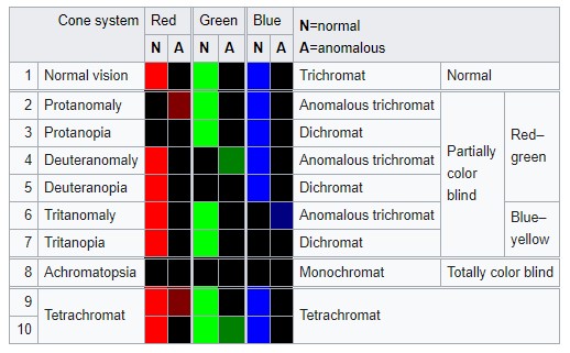
Color blindness is genetically inherited. About 8% men (esp. northwestern European descent), 0.5% women around the world
Red-green color blindness is passed down on the X chromosome, of which men have only 1 X chromosome (women have 2).
Color blindness 2
Common: red-green deficiency (deuteronomaly 6% of males). Less common: protonomaly (2 % of males).
Rare: blue-yellow deficiency, tritanomaly (<0.01%).
More info on color blindness
Video: What causes color blindness?
Color blindness 2
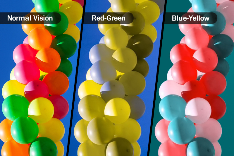
Vischeck: color blindness simulation and correction
Colorspace
A colorspace is a system for describing color numerically.
- RGB
- CMYK
- HSV/HSL
- CIE Lab
- CIE HCL
There are many more: XYZ, Munsell, CMS, etc.
Reading: List of color spaces
Colorspace: RGB

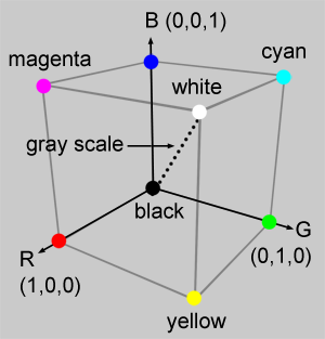
Left: Magnification of pixels on a screen. Right: RGB color cube.
RGB colorspace is additive (i.e. more colors added, the lighter it is).
Problems: Not perceptually uniform.
Chromaticity and Color Gamut
Video: CIE 1931 Chromaticity Diagram
Video: Color Gamuts
Wiki: CIE 1931 space and chromaticity
Reading: What are display color gamuts? sRGB, DCI-P3, Rec. 2020 explained
CIE (Commission internationale de l'éclairage, or International Commission on Illumination) - international authority on light, illumination, colour, and colour spaces.
Colorspace: CMYK
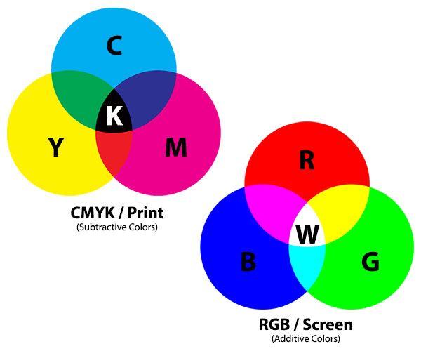
CMYK colorspace is subtractive (i.e. more colors added the darker it is).
CMY is lighter than RGB. Typically for print only.
Reading: Why printing uses CMYK
Video: CMYK vs Pantone vs RGB
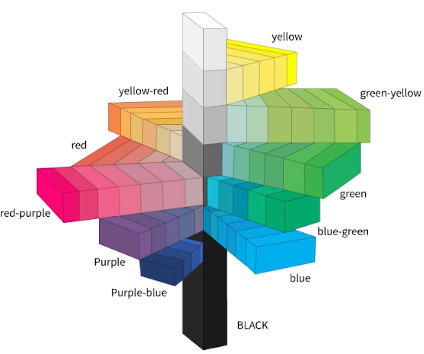
Colorspace: HSV/HSL
H = Hue, S = Saturation (vividness of color), V/L = Value / Lightness
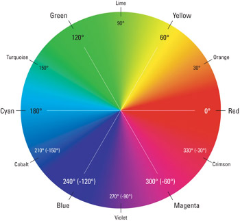
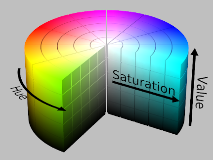
Left: Hue described radially. Right: HSV color cylinder
Problems: More intuitive, but also not perceptually uniform.
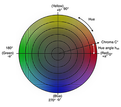
Colorspace: CIE Lab (or Lab)
L = Lightness, a = red-green scale, b = yellow-blue scale
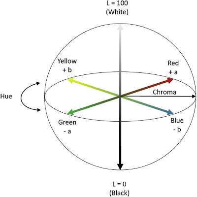
CIE (Commission internationale de l'éclairage, or International Commission on Illumination) - international authority on light, illumination, colour, and colour spaces.
Designed to better approximate human perception of color.
Perceptually linear (or close).
Colorspace: CIE HCL (or HCL)
H = Hue, C = Chroma, L = Luminance
H and C are transformations of a and b in the Lab model.
Perceptually linear, and more intuitive.
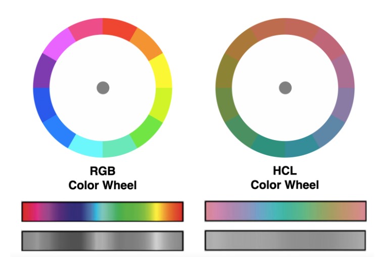
Colorspace comparison
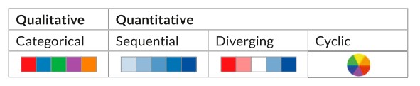
Recap: Color channels
Magnitude channel (quantitative) or identity (qualitative)?
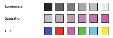
Hue and saturation (purity of color) affects luminance (brightness of color)
D3 Color
Viridis color palette
Recap: color blindness
- Colorful (spans wide palette)
- Perceptually uniform
- Robust to color blindness
- Pretty!
Reading: "Perceptually uniform?" D3 color scales
Reading: 5 tips on designing colorblind-friendly visualizations
Redundantly encode channels - shape, tooltip, etc.
Color Tools
Recap: Channel effectiveness: Discriminability.
Not too many color bins. Perceptually distinct colors.
ColorBrewer.org: An Online Tool for Selecting Colour Schemes for Maps
Color: Channel Implications
Channel: separability - luminance and saturation are not the most separable. Also not separable from transparency. For separability, pick hue vs saturation / luminance.
Channel: salience (popout) - small number of bins.
Rainbow color maps: Pros and cons
Choosing colors for your visualization
Using color in Information Display Graphics (NASA color usage research lab)
Color: Contrast
Color is perceived differently depending on how it is contrasted with other colors. It is relative and not absolute.
Bezold Effect and White's Illusion
Color Theory & UX
Color theory is the collection of rules and guidelines which designers use to communicate with users through appealing color schemes in visual interfaces.
Questions?
Chi-Loong | V/R