1b: The big picture
Data visualization questions
Big picture questions 1
- Why have a human in the decsision making loop?
- Why have a computer in the loop?
- Why use an interface / external representation?
- Why depend on vision?
Big picture questions 2
- Why visualize data in detail?
- Why use interactivity?
- Why is the viz idiom design space huge?
- Why focus on tasks? i.e. why (task) over what (data) and how (idiom)
Big picture questions 3
- Why focus on effectiveness? i.e. why validate visualizations?
- Why are a lot of designs ineffective?
- Why is validation difficult?
- What resource limitations are there?
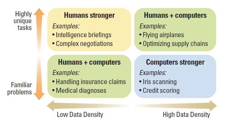
Why have a human in the decision making loop?
Visualizations allow people to analyze data when they don't know exactly what questions need to be asked in advance.
AI allows for automation of repeated tasks, but these tasks need to specified (to a certain extent).
It's easier than ever to use AI to create visualizations.
Paul Schoemaker and Phillip Tetlock, Building a More Intelligent Enterprise
Why have a computer in the loop?
Speed and data size. Huge amounts of data can be processed and displayed in real-time that wouldn't be feasible for human beings to do.
Computer interfaces also allow new forms of interactivity in a visualization.
Why use an interface / external representation?
Human beings have been using maps and diagrams for millenia to surpass our own internal cognition and memory.
Why depend on vision?
Because the visual system provides a very high bandwidth channel to our brains.
Even though we can only see a tiny part of our visual field in high resolution at any point, our brains fill in the rest. We are good at seeing the big picture.
Sonification has never taken off, as sound is not good at providing overviews of large information spaces compared with vision. We think of sound as sequential.
Taste, smell, and haptic touch are even more limited in terms of communicating abstract information.
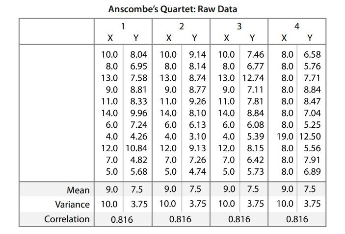
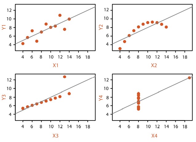
Why visualize data in detail?
For exploratory analysis, visualization helps people understand the dataset structure better. If you only rely on summary statistics, you could be get a wrong understanding.
Anscombe's Quartet is an extremely powerful example why.
Francis John Abscombe (1918-2001)
A more recent example: Datasaurus dozen
"Same Stats, Different Graphs: Generating Datasets with Varied Appearance and Identical Statistics through Simulated Annealing" (Justin Matejka, George Fitzmaurice, 2017)
For storytelling, giving your users an ability to deeply dive into your dataset (navigate the ladder of abstraction) can engender trust.
Why use interactivity?
The bigger and more complex the dataset, the harder it is to show it all at once given the limitations of both people and display.
Computer systems allow us new viz idioms by allowing interaction, changing the view when an action (search, filter, etc.) is taken.
Interactivity often is key to being able to visualize complex datasets — from high level overviews to nitty gritty data details — allowing users to go up and down the ladder of abstraction easily.
Why is the viz idiom design space huge?
Although there are just a few standard charts that we as humans are familiar with (e.g. bar, line, pie, scatterplot, etc.), you can combine basic chart types (especially with interaction) and make complex viz idioms.
Like music with the same basic 12 tones, or writing with the same grammar and vocabulary, by combining the basics, you can produce complex data visualizations.
Why focus on tasks (why) over data (what) and idioms (how)?
Because why the user is interacting with the data greatly changes the final result.
Visualizations for exploratory analysis vs for presentation / enjoyment is vastly different.
Are you creating a visualization that is a once-off (to get an idea of the data), putting together a nice presentation to explain insights, or building a tool to automate this process?
Why focus on viz effectiveness?
Because we should measure how effective the visualization is in supporting user tasks.
If you're doing storytelling, the story should be measured on how effective it was as a communication channel.
If you're doing exploratory analysis, what insights have you gained to help aid whatever model you're doing?
If you're doing a tool, how much time / effort have you saved by creating said tool?
Why are most designs ineffective?
Tamara's position here may be is a little pessimistic, but I understand her point of view.
Because there are so many ways to mash-up data and viz idioms, the likelihood you'll get a bad design far outstrips a good one.
Like in the music analogy, you can randomly throw notes together, but it most likely won't make a good song.
Why is validation difficult?
Tamara's argument is that there could be many ways to ask if the visualization has met your user's needs.
Whilst labels like effective communication and insight engagement are not hard science, UX can still be measured (via interviews, surveys, etc.).
A good user-centric experience design process can help with validating some of these issues. We'll look into this in later parts of the course.
What resource limitations are there?
Of course there are resource limitations. Human perceptual / cognitive capacity, computational capacity and display capacity.
Interaction helps solve some of the perceptual / cognitive load, but we're still vulnerable to human quirks like change blindness.
On the technical front, we will be going through some of the limitations of drawing for the web later in the course.
Important figures
Aka literature review
Jacques Bertin
1918-2010
Semiology of Graphics (1967)
Key ideas:
- Visual variables (marks)
- Early taxinomy of network layouts - arc diagram, treemap, etc.
- Bertin's matrix (precursor to the modern heatmap!)
- Interaction ideas (before computers!) on "reordering" rows before presenting results
Edward Tufte
Principles for visualizing quantitative information (1983)
Key ideas:
- Small multiples (facets). Well-known for sparklines
- Data-ink ratio
- Chartjunk
-
Principles of graphical integrity
Bonus links: WTF Viz
Bonus example: Truth of hike in petroleum prices
- Tufte hates pie charts with a passion
Hans Rosling (1948-2017)
TrendAnalyzer and Gapminder
Key ideas:
- Popularized data visualization and animation
- Gapminder World
- TED talk: Hans Rosling - the best stats you've ever seen
Ben Shneiderman
Human Computer Interface, information visualization
Key ideas:
Leland Wilkinson
Grammar of Graphics, 1999
Key ideas:
- Influential in describing a framework for charting graphs.
- Influenced R's ggplot2, Python's Mathplotlib libraries.
Readings:
Telling stories with data using the grammar of graphics, Liz Sander
Think about the grammar of graphics when improving your graphs, Thomas de Beus
Handley Wickham, Mike Bostock
Ggplot2 (Handley) and D3 (Bostock)
Bostock is also the founder of Observable HQ and Observable Plot
This NYT visualization by Bostock started me down my rabbit hole.
Others: (mainly blogs)
Flowing Data (Nathan Yau)
Information is Beautiful (David McCandless)
Visualizing Data (Andy Kirk)
Junk Charts (Kaiser Fung)
Interactive Data Visualization (book) (Scott Murray)
Questions?
Chi-Loong | V/R