CSC3007 Information Visualization
Hello
My name is Chi-Loong and I'll be your adjunct lecturer for this course.
You can call me Chi-Loong or Mr Chan.
Past lives
I spent half my career in storytelling. I was in journalism and public relations in the tech space for a decade.
The other half is in technology — I have a background in computer science — also about a decade-plus.
I have run my own consulting-based visualization / code studio at V/R for the last 9 years.
Current lives
I have taught two semesters of interactive data visualization at SUTD's HASS masters' course.
I have also taught at code schools like General Assembly and SGCodeCampus on visualization.
I also head up product at start-up Mogul.sg managing product design + dev.
Community
I run the local Singapore Data Viz SG and HHSG meetup groups.
My own passion project is Visualizing Singapore (viz.sg), a community site for data viz enthusiasts. I version of the site has been up since 2015.
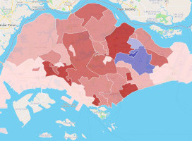
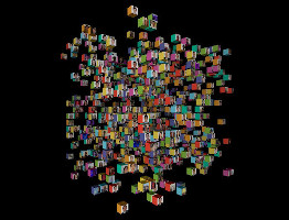
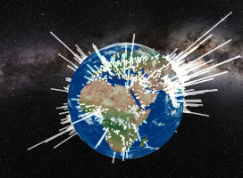
Examples


Course vision
There are three ways to approach the domain - research, technical, or industry.
As a practitioner in the space I tend to approach the domain from an industry perspective with a technical slant.
In my previous master courses I had more flexibilty to curate online guest lectures in the evening, but this is more diffcult at SIT.
Theory and code
The course material is split up into two components — theory and code.
In the theory portion, we will go through the research paired with lots of real-life case examples.
In the code portion, we will be building interactive data visualizations for the web.
On technology
Visualizations can be built with all kinds of software tool / cloud-based platforms.
However, for an interactive visualization course I will going through how to do it natively for the web.
We'll be using D3 (Data Driven Documents), the defacto data visualization library for the web.
Why D3
- If you're interested in analytics, Excel / Tableau / PowerBI are good non-coding choices.
- If you're familiar with data science languages, Python or R has graphing libraries (ggplot2, plotly, mathlibplot, etc.)
- D3 is used because you want to build beautiful interactive visualizations for the web. You can go really deep to get the interactions you want.
- It also has comprehensive built-in design patterns for visualizations, like geo projections, force simulations, hierarchies, etc.
- Lastly, it is open source and free.
How to build for web
- For web visualization there are many libraries / tools / platforms beyond D3.
- If you are pressed for time for a standard chart type, it might be easier to use other tools / libraries built on top of D3.
- You can also use other libraries (leaflet, highcharts, etc.) to build the components you need.
- There are even full platforms - Mapbox, Cesium, etc. that will allow you to host and build on top of those platforms.
Course expectations
Some web development is a technical requirement for this course. It is expected that you know HTML / CSS / JS.
I might run through some recap refreshers, but it will be quick.
If you are weak in this area you will have to do your own reading and self-revision.
By now you should know how to write some web stuff. There are tons of tutorials on the web.
If you want to use more complicated frameworks / architectures to build your visualizations, please do go ahead. But it is not neccessary.
Course expectations 2
On the JS side, you should also know how to pull data from APIs (AJAX), data formats like JSON (GeoJSON, TopoJSON).
Beyond HTML / CSS / JS, we will also be using Git, a modern version control tool.
Students will be publishing their assignments and work on GitHub and GitPages.
If you do not have a GitHub account, please do sign up for one. You should have one by now.
Course expectations 3
I will go through some lab sessions in D3, and a smattering of geospatial tools like Leaflet.
However, if you prefer to use other web-based tools for the final project, you are free to do so.
The only requirement is that you must publish your work on a GitHub repository (through GitPages).
For coordination for this module, we will be using communication tool Slack.
The spirit of the course
You come to school to learn, so let's sidetrack and have an old engineer like myself chat with you folks on this a bit.
Introduction to Data Viz
Why data visualization?
Wiki definition
To communicate data / information clearly and effectively by encoding it as graphical visual objects (e.g. points, lines).
Historical viz

Charles Joseph Minard's 1869 diagram of Napoleonic France's invasion of Russia.
It shows the number of men in Napoleon’s 1812 Russian campaign army, their movements, as well as the temperature they encountered on the return path.
Historical viz 2

John Snow's map of the 1854 cholera outbreak in Soho, which helped debunk the then-dominant miasma theory.
Exploratory or explanatory analysis?

A 3rd category: Engineering a data visualization product / tool to automate exploratory / explanatory analysis.
Visualization analysis

- What: What data does the user see?
- Why: Why does the user want to use a viz tool?
- How: How is the visual encoding and design choices chosen?
These three questions form the data — task — idiom trio.
A broader definition
Computer-based visualization systems provide visual representations of datasets designed to help people carry out tasks more effectively.
Reading: Data visualization literacy framework
Reading: Chapter 1, Visualization Analysis and Design (Tamara Munzner)
Course structure recap
Let's take a closer look at how this course is structured.
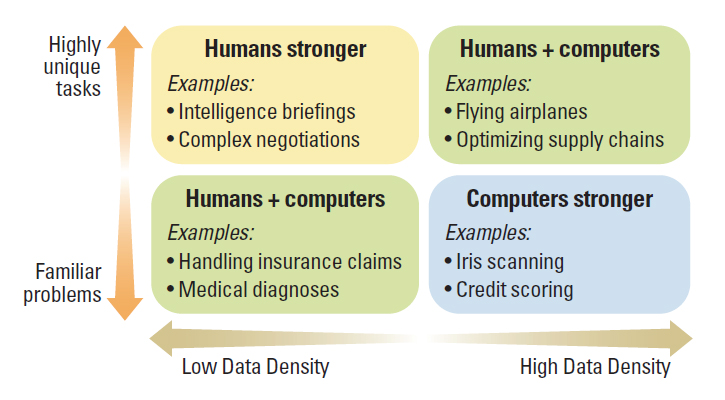
Big picture questions 1
- Why have a human in the decsision making loop?
- Why have a computer in the loop?
- Why use an external representation?
- Why depend on vision?
- Why show data in detail instead of just summarizing the statistics?
- Why use interactivity?
Big picture questions 2
- Why is the viz idiom design space huge?
- Why focus on tasks? i.e. why over what (data) and how (idiom)
- Why focus on effectiveness? i.e. why validate visualizations?
- Why are a lot of designs ineffective?
- Why is validation difficult?
- What resource limitations are there?
Big picture questions
Perspectives to further think about
Why have a human in the decision making loop?
Visualizations allow people to analyze data when they don't know exactly what questions need to be asked in advance.
Machine learning allows for automation of repeated tasks, but these tasks need to specified (to a certain extent).
Paul Schoemaker and Phillip Tetlock, Building a More Intelligent Enterprise
Why have a computer in the loop?
Speed and data size. Huge amounts of data can be processed and displayed in real-time that wouldn't be feasible for human beings to do.
Computer interfaces also allow new forms of interactivity in a visualization.
Why use an external representation?
Duh. Human beings have been using maps and diagrams for millenia to surpass our own internal cognition and memory.
Why depend on vision?
Because the visual system provides a very high bandwidth channel to our brains.
Even though we can only see a tiny part of our visual field in high resolution at any point, our brains fill in the rest. We are good at seeing the big picture.
Sonification has never taken off, as sound is not good at providing overviews of large information spaces compared with vision. We think of sound as sequential.
Taste, smell, and haptic touch are even more limited in terms of communicating abstract information.
Why show data in detail?
Visualization helps people understand the dataset structure better than only seeing the statistic summary of it.
Anscombe's Quartet is an extremely powerful example why.
Francis John Abscombe (1918-2001)


A more recent example: Datasaurus dozen
"Same Stats, Different Graphs: Generating Datasets with Varied Appearance and Identical Statistics through Simulated Annealing" (Justin Matejka, George Fitzmaurice, 2017)
Why use interactivity?
The bigger and more complex the dataset, the harder it is to show it all at once given the limitations of both people and display.
Computer systems allow us new viz idioms by allowing interaction, changing the view when an action (search, filter, etc.) is taken.
Interactivity often is key to being able to visualize complex datasets — from high level overviews to nitty gritty data details — allowing users to go up and down the ladder of abstraction easily.
Why is the viz idiom design space huge?
Although there are just a few standard charts that we as humans are familiar with (e.g. bar, line, pie, scatterplot, etc.), you can combine basic chart types (especially with interaction) and make complex viz idioms.
Like music with the same basic 12 tones, or writing with the same grammar and vocabulary, by combining the basics, you can produce complex data visualizations.
Why focus on tasks?
Because why the user is interacting with the data is important.
Visualizations for exploratory analysis vs for presentation / enjoyment is vastly different.
Are you creating a visualization that is a once-off (to get an idea of the data), putting together a nice presentation to explain insights, or building a tool to automate this process?
Why focus on effectiveness?
Because we should measure how effective the visualization is in supporting user tasks.
If you're doing storytelling, the story should be measured on how effective it was as a communication channel.
If you're doing exploratory analysis, what insights have you gained to help aid whatever model you're doing?
If you're doing a tool, how much time / effort have you saved by creating said tool?
Why are many designs ineffective?
I feel Tamara's position here is a little pedantic, but I understand her point of view.
Because there are so many ways to mash-up data and viz idioms, the likelihood you'll get a bad design far outstrips a good one.
Like in the music analogy, you can randomly throw notes together, but it most likely won't make a good song.
Why is validation difficult?
Tamara's argument is that there could be many ways to ask if the visualization has met your user's needs.
Whilst labels like effective communication and insight engagement are not hard science, I believe that this can still be measured (via surveys).
A good user-centric experience design process can help with validating some of these issues. We'll look into this in later parts of the course.
What resource limitations are there?
Of course there are resource limitations. Tamara states three: Human perceptual / cognitive capacity, computational capacity and display capacity.
Interaction helps solve some of the perceptual / cognitive load, but we're still vulnerable to human quirks like change blindness.
On the technical front, we will be going through some of the limitations of drawing for the web later in the course.
Questions?
Chi-Loong | V/R